


[PT] Sobre a empresa
A Company Kids é uma empresa de vestuário infanto-juvenil que atende crianças e adolescentes entre 0 e 16 anos. Após uma pausa em suas atividades, a empresa está retornando ao mercado com um novo posicionamento de marca, visando se tornar uma loja física com fabricação de peças próprias e vendas no atacado.
Atualmente, a empresa trabalha com revenda de multimarcas, oferecendo produtos intermediários de qualidade superior com o objetivo de proporcionar aos clientes o melhor custo-benefício. Com essa mudança, a Company Kids busca oferecer produtos exclusivos e de alta qualidade para atender às necessidades dos seus clientes e se consolidar como referência no mercado de vestuário infanto-juvenil.
[EN] About the company
Company Kids is a children's clothing company that serves children and adolescents between 0 and 16 years old. After a break in its activities, the company is returning to the market with a new brand positioning, aiming to become a physical store manufacturing its own parts and selling wholesale.
Currently, the company works with multi-brand resale, offering intermediate products of superior quality in order to provide customers with the best cost-benefit ratio. With this change, Company Kids seeks to offer exclusive and high quality products to meet the needs of its customers and consolidate itself as a reference in the children's clothing market.


[PT] Inspiração do projeto
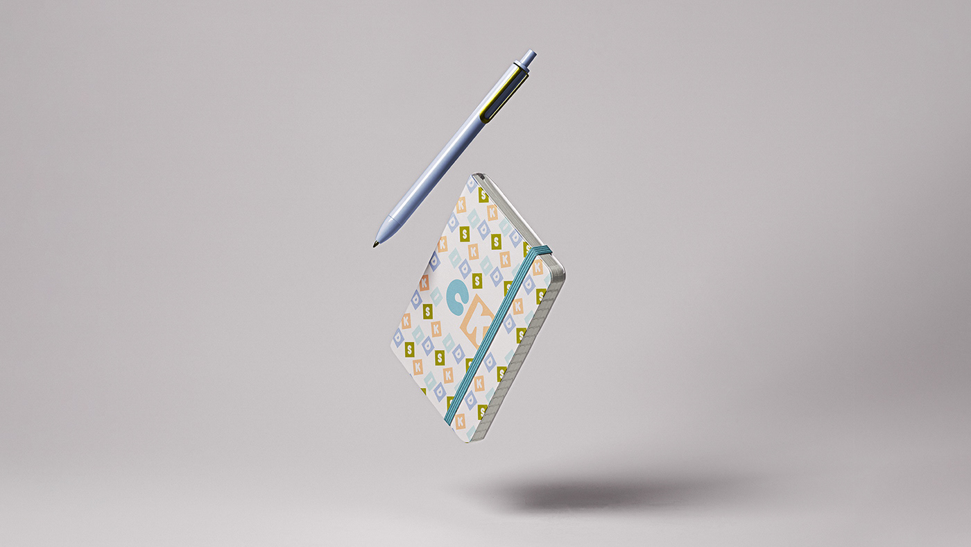
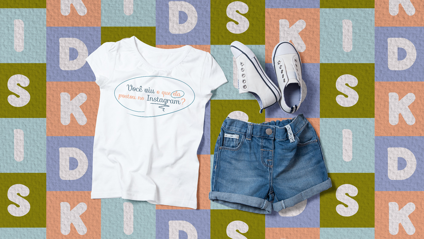
Desde o início do projeto, a cliente deixou claro que não queria um design muito "fofo" ou excessivamente decorado. Ela desejava algo diferente e fora do comum. Quando ela nos informou que a loja seria instalada em um contêiner, percebemos a importância de incorporar essa característica no projeto. Foi a partir daí que notamos como os contêineres coloridos utilizados em navios ou portos lembram um brinquedo infantil, com seus blocos coloridos. Com isso em mente, utilizamos essa ideia para reforçar a identidade visual da marca, criando um design para a loja que se assemelha a um grande bloco de metal, com suas cores vibrantes e marcantes.
[EN] Project inspiration
From the beginning of the project, the client made it clear that she didn't want a design that was too "fluffy" or overly decorated. She wanted something different and out of the ordinary. When she informed us that the store would be installed in a container, we realized the importance of incorporating this feature into the project. It was from then on that we noticed how the colored containers used on ships or ports resemble a children's toy, with their colored blocks. With that in mind, we used this idea to reinforce the brand's visual identity, creating a design for the store that resembles a large metal block, with its vibrant and striking colors.


[PT] Os desafios do projeto
O projeto teve que enfrentar grandes desafios, como o reposicionamento profissional da marca no mercado, a criação de uma marca infanto-juvenil que se destacasse dos clichês comuns desse setor e o desenvolvimento de uma marca que atendesse a um público de faixa etária bastante ampla.
Para reposicionar a marca, foi necessário fazer uma análise do mercado, identificar o público-alvo e definir estratégias adequadas. Já na criação da marca, foi preciso um processo criativo intenso que levasse em conta as tendências atuais e, ao mesmo tempo, oferecesse algo autêntico e diferenciado. Por fim, desenvolver uma marca que atendesse a uma faixa etária ampla exigiu um equilíbrio entre simplicidade e sofisticação, para que a marca pudesse ser atrativa tanto para crianças como para adolescentes.
[EN] The challenges of the project
The project had to face major challenges, such as the professional repositioning of the brand in the market, the creation of a children's brand that stood out from the common clichés of this sector and the development of a brand that catered to a very wide age group.
To reposition the brand, it was necessary to carry out a market analysis, identify the target audience and define appropriate strategies. In the creation of the brand, however, an intense creative process was necessary that took into account current trends and, at the same time, offered something authentic and differentiated. Finally, developing a brand that catered to a broad age range required a balance between simplicity and sophistication so that the brand could appeal to both children and teens.


If you've made it this far, I would greatly appreciate it if you could leave a like.
Vamos criar um projeto incrível juntos?
Let's create an amazing project together?
Talk to me: contato@estudiopegada.com.br
follow me on Instagram: @estudiopegada
Access my websiter site: www.estudiopegada.com.br
Estúdio Pegada - All Rights Reserved


